By default NagVis can only visualize the normal states in lines using red, yellow and green coloured lines. Have you ever wanted NagVis to display nice weathermap style lines?
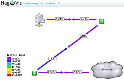
Since NagVis 1.5 it is possible to draw such weathermap style lines which can have more than three colours depending on the current load of e.g. the network interface you like to visualize. There can be a wide colour range of e.g. seven different colours. Take a look at the example image - isn't that beautiful?.
The weathermap style lines currently provide two types of lines:
---%--><--%----: Arrows with percentage labels in the middle of the line.---%+BW--><--%+BW---: Arrows with percentage labels in the middle of the line and additional labels which display the current bandwidth usage.The new lines are focused on bandwidth visualization. Since NagVis needs to parse the performance data to gather the current colour for the line there are special requirements on the performance data contents. There is a bandwidth measurement plugin for Nagios which comes with the correct performance data information out of the box. It is downloadable from Nagios Exchange.
To create weathermap style lines in NagVis you need services which send the correct performance data to Nagios. If you got some then simply place a line service object on the map and choose the correct line type. Now take a look at your map - it should work now.
You may want to have a legend which shows you the meaning of the different colours. No problem. Simply add a shape to your map and choose the "demo_traffic_load_legend" shape which is delivered with the NagVis core package.
The weathermap lines do not require a specific Nagios plugin. Only the provided performance format needs to match one of the cases below:
inUsage=21103.42%;85;98 outUsage=226363.55%;85;98 inBandwidth=105.52MBs
outBandwidth=212.22MBs.in=7196.50566429;;;0;1250000.0 inucast=11.6273564992;;;; innucast=0.017617206817;;;; indisc=0.0;;;; inerr=0.0;0.01;0.1;; out=4044.9635368;;;0;1250000.0 outucast=12.1734899105;;;; outnucast=0.0;;;; outdisc=0.0;;;; outerr=0.0;0.01;0.1;; outqlen=0;;;;.
Thanks to gjfrater for implementing these lines!